
Seattle Scone Co.’s founder had a beautiful vision for her brand, creating the original identity herself and carrying it through two successful years of farmers markets. When it came time to expand and grow, the current logo didn't fit the future the company saw for themselves. We worked closely with the founder to help fully realize the next generation of her vision with a refreshed identity system that could match both her ambition and the quality of her scones. While her original logo carried the business through its early stages, it lacked legibility, flexibility, and the refined presence needed for growth.
Together, we reimagined a system that feels both artisanal and luxurious while being grounded in tradition and designed to scale across packaging, signage, and digital platforms. By emphasizing "Scone" and moving Seattle lower in the visual hierarchy, as well as removing the Seattle skyline from the primary logo, the brand could more easily consider moving beyond the borders of it's founding city.
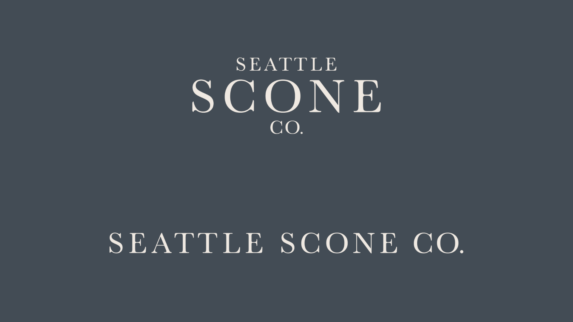

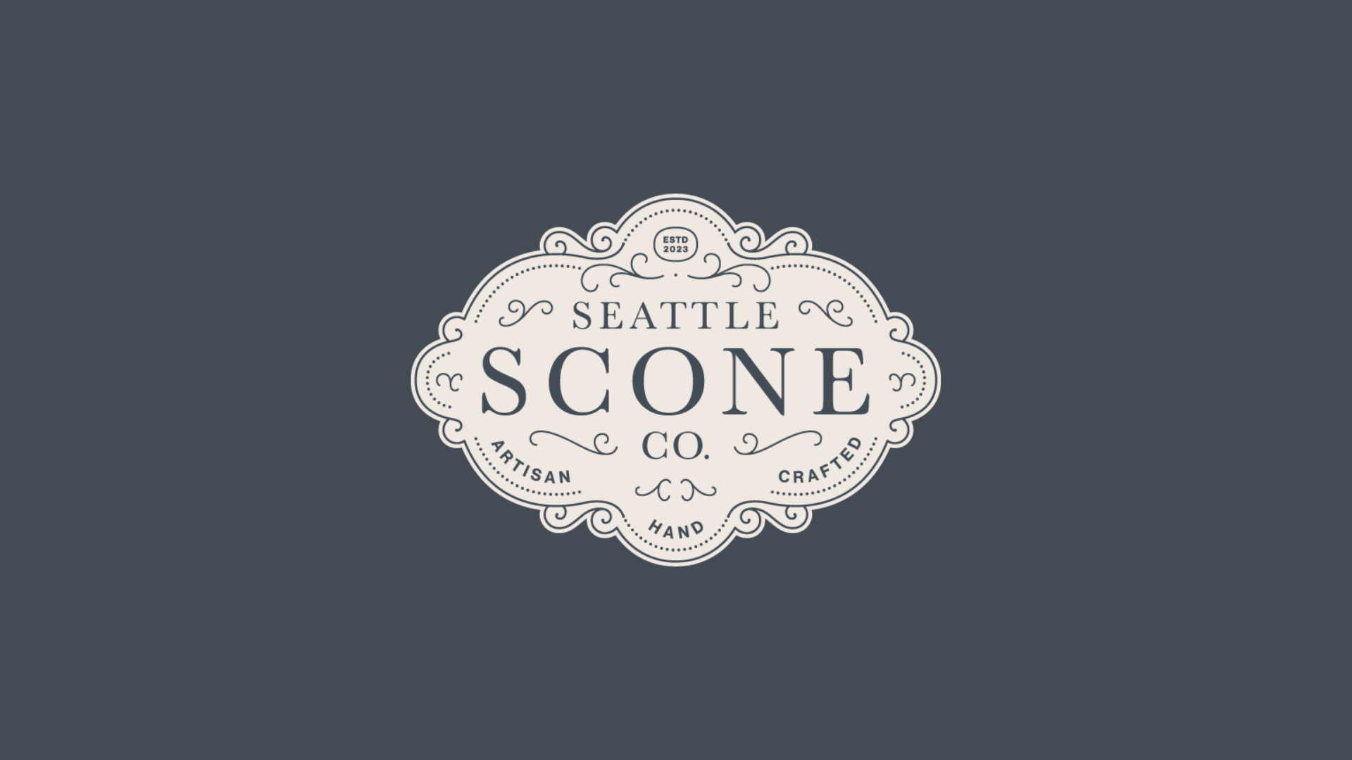
The updated identity centers on a refined seal logo with ornamental flourishes inspired by piped icing, paired with a custom wordmark, monogram, and skyline icon. This suite of marks offers flexibility across applications while conveying craftsmanship, warmth, and quiet sophistication. The result is a brand that honors Seattle Scone Co.’s roots while positioning it for expansion throughout Seattle and beyond.

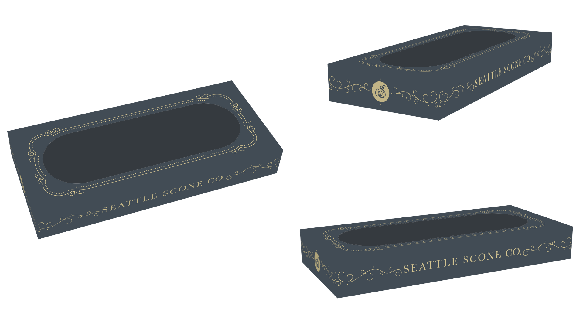
Our first application of the refreshed brand was the design of a custom pastry box for fresh-baked scones. Inspired by French patisserie packaging, the box features a pill-shaped display window, matte soft-touch coating, and gold foil detailing that highlights the new logo elements. Sized specifically to fit four scones, the design balances elegance with practicality, creating an elevated unboxing experience for customers at markets and cafés.
With the fresh box now in production, we’re continuing to build the packaging system for frozen scone boxes, supporting Seattle Scone Co.’s ultimate goal of bringing their handcrafted scones to grocery aisles, while our architecture and interior design team works to solidify the perfect brick-and-mortar space for growing company looking to expand their brand beyond local farmer's markets. This evolving project highlights our ability to connect brand identity, packaging, and future architectural space into a cohesive, multi-sensory experience.
